 |
Deer In the Forest, 1911
Franz MarcOil on Canvas, 100.97 x 104.78 cm Philips Collection, Washington DC, USA |
As you can see, the palette is filled with a whole rainbow of rich colors...so many options to choose from! Since this is an art bead challenge, I started by digging out my boxes of focal beads and artisan clasps to see what I had that would fit the bill. I found a lovely enameled copper pendant by Becka Beads out of Maple Lake, MN. I had bought it (and a bunch of others) when she had a shop at the Minnesota Renaissance Festival. The colors worked perfectly and I thought the swirls of color matched the feel of the painting as well.
I had my art bead...now to figure out where to go with the design. The colors that jump out at me the most are the shades of green and the orangey reds. I wanted to focus my colors there, but I didn't want to totally ignore all the other great colors in the painting. Plus, I've really been wanting to get out of my monochromatic rut. So, to that end, I pulled out a variety of blues, yellows, and even some cool off white shell beads with a swirl on them to add to the mix of possibilities I had already started.
Originally I thought I'd do something with copper wire links and chain...maybe add in some of the new copper plated bead caps I bought from Nunn Design. As I sat there staring at my pile of beads, willing them to bring themselves into some order, I suddenly wondered if stringing beads might be the answer. I grabbed a scrap of beading wire, dumped out some bronze colored seed beads to use as spacers, and started stringing my motley collection of bead shapes and colors. Here is the result of this little experiment...
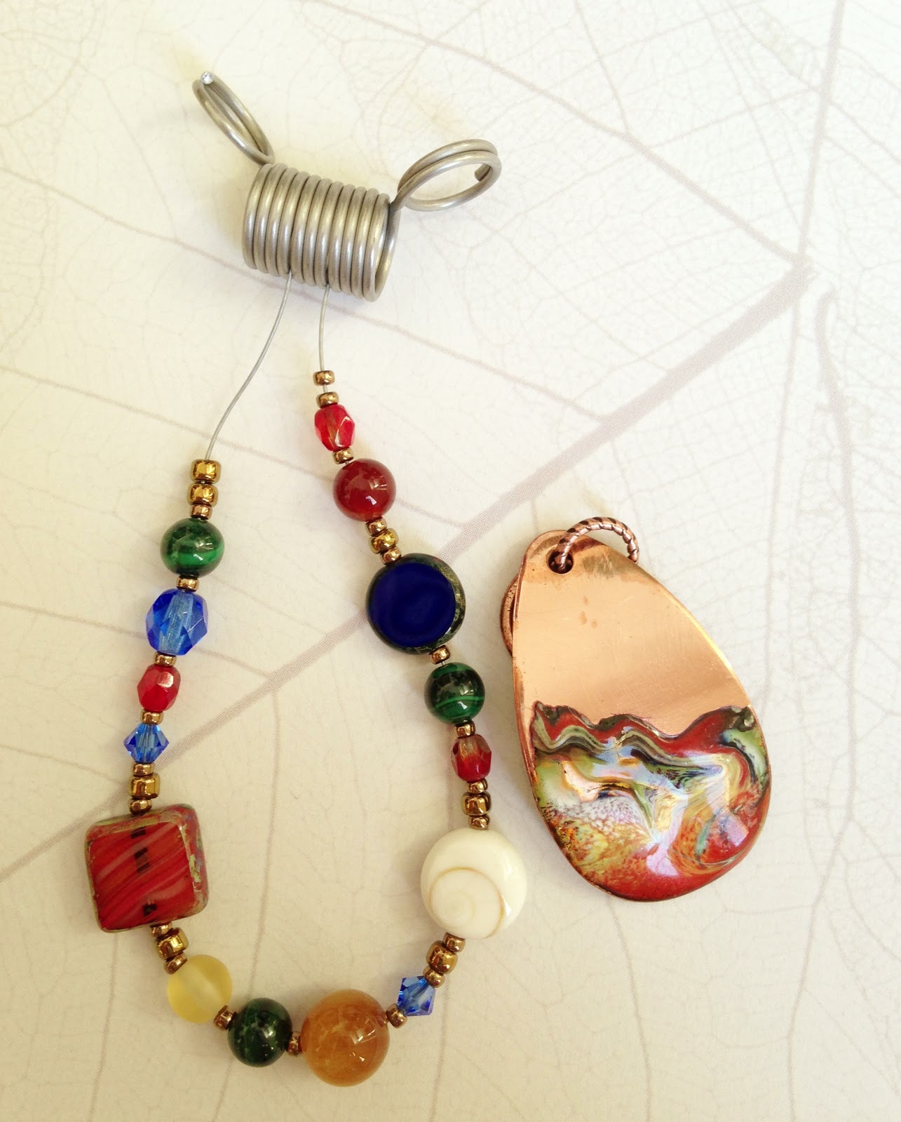
I showed my progress to Eric (who often acts as my color and design consultant) and we decided that we liked the idea, but needed to nix the bright blue Swarovski crystals and Czech glass in favor for more subtle blue beads. The blue is very present in the painting, but not really so much in my pendant. Back to the drawing board to grab some more beads to add to the mix and I had my design direction.
I wanted to do a front clasp since I had a great leafy branch toggle from Nunn Design that would add an organic touch to the necklace. Usually when I string beads I tend toward a symmetrical pattern...or at least something a little more subtle in the mixture of colors, sizes, and textures. I ended up using a variety of Czech glass beads, malachite, carnelian, lapis, shell, and a couple of varieties of jasper.

This necklace is a bit out of my normal comfort zone, but I like the end result. I think the variety of colors and shapes in the beads, along with the swirls in the shell bead and pendant, mimics the frenetic color energy in the inspiration painting.
You could not have chosen a better focal for this challenge. Just stunning, and great mix of hues in your supporting beads. Changing up the blues brought the perfect balance. LOVE this piece!!
ReplyDeleteThanks so much! And thanks for checking out my blog!
DeleteBeautiful design, Sarajo... that is my favorite place for a pretty clasp, too. Just like having an extra focal!
ReplyDeleteThanks Monique!
Delete