Showing posts with label Design Process. Show all posts

Monday, May 6, 2013

Vintaj Weeping Willow Design Challenge

This month's Vintaj Design Challenge, "Weeping Willow," hit near and dear to my heart.  Trips to Big Spring Park to feed the ducks were a favorite treat when I was a child.  My mother's mom, my Mema, used to take me down there with a big bag of bread to feed the ducks on many a summer day.  (Although, let's be honest, the giant goldfish got quite the snack too!)  We would park ourselves under this giant weeping willow tree to feed and watch the ducks and fish from under that cool, green canopy.  Any of my readers who are familiar with with my hometown of Huntsville, Alabama will probably know exactly what I'm talking about here.


Sadly, neither my Mema nor that majestic tree are still with us but I was able to find the picture above on the About.com website for Huntsville.  I hope that the necklace I made manages to capture a little bit of the magic of spending time with my grandmother  underneath the weeping willow.

I started with some little leaf blanks that I had embossed and painted in shades of green and yellow and then grabbed any and all possible beads to mix into my design.  I actually hadn't originally thought I'd make a necklace... I planned to use both sets of embossed leaves in a pair of earrings but later decided that would be too much.  So enter the idea of a necklace and earrings.  I'm going to keep you in suspense on the earring front... you'll get to see those in the next Art Jewelry Elements Earring Challenge reveal this weekend!


I chose to use the more yellow pair of leaves in the necklace.  I wanted to try wire wrapping the brass branch piece to make a toggle clasp with the filigree ring.  I've had the branches for awhile but have been nervous about my wire skills!  I used some finer, soldered chain so I had to really play with the placement of the dangles before committing to finishing the wire wraps.


The leaves and beads hanging from the lengths of chain are meant to feel like the draping branches and leaves of the willow tree.  All the shades of green are for the colors in the tree and surrounding park.  Anyway, without further ado, here's the finished product.  This one's for you, Mema!  I miss you!


You can see the other entries and vote by clicking HERE.  Mine is number 8!

And as a P.S. to this post, here is the only picture I could find at my house of a tiny me with my Mema.  (Lots of photos of me posing at her house though!)


Tuesday, April 16, 2013

April Art Bead Scene Challenge

I didn't think that I would have the energy or time to make something for this month's Art Bead Scene challenge, but when I saw the inspiration artwork, I just couldn't resist!  Maybe it's because this Minnesotan winter doesn't seem to want to end, but the beautiful spring meadow in full bloom had me itching to create!  If you want to read more about the painting you can check out the post over on the ABS blog HERE.


Walk in the Meadows at Argenteuil, 1873
Claude Monet
Color Palette by Brandi Hussey
Often the rate limiting step in choosing to do one of these challenges is what sort of art beads I have in my stash that might work.  Luckily, I had just purchased a pendant mix from Tracee Dock of The Classic Bead on Etsy and one of the flower pieces was just the thing.  Around the same time I also brought home a new seed bead mix from Glass Garden Beads out of Northfield, Minnesota that had the same colors as the pendant plus a little grey and black.  I knew immediately that I wanted to do a multi-strand necklace using the seed beads and some chain for two of the strands.  You can see the things I started with in the photo below.


I really haven't made too many multi-strand necklaces in my jewelry making career.  (We'll add this to the list of things I'd like to learn to do better.)  I tend to stress out about getting everything to be the correct length and lay right... especially when I'm stringing beads or working with closed link chain which aren't too forgiving if you are off on your measurements.  Anyway, my vision was for multi-strand so it was make it work time!   

I knew that I needed to add in some of the other colors from the painting in my third strand.  I decided to focus mostly on the shades of green while also adding some small pops of orange.  I added a few larger yellow seed beads to tie the strands together a little more.  Once I had my three strands completed I was ready (at least I thought I was!) to add the cones at either end of the strand to pull things together and give it a more polished look.  At that point I took a look to make sure I was happy before finishing the wrapped loops on each end of the cones.  I decided that things looked a little disjointed color-wise and thought that maybe another strand of the turquoise and yellow seed bead mix was what it needed.  I did a little more stringing and was finally ready to finish off the ends!  Here are a couple of pictures showing you the strands before and after getting them all finished and the wire wraps completed... see what a mess I'm hiding under there?


I ended up using a longer cone than the one I was originally thinking.  The shorter one just didn't hide the crimp tubes on the beaded strands well enough.  Even though the pattern on the pewter cones is supposed to be Celtic knot work, I think it has a woven basket feel that fits nicely with the pastoral scene in the painting.  The aqua colored crystals help tie everything together and give it a little extra pizazz.  I left a little extra chain to give some flexibility as far as how long to wear the necklace. 

Here's the finished product... now I just have to decide if I want to sell this one or keep it for myself!


Wednesday, March 13, 2013

March Art Bead Scene Challenge

Once again I'm participating in the Art Bead Scene's monthly design challenge.  This month, the challenge artwork is by Franz Marc, a German Expressionist painter.  You can find out more about the artwork and artist over on the ABS blog.


Deer In the Forest, 1911
Franz Marc
Oil on Canvas, 100.97 x 104.78 cm
Philips Collection, Washington DC, USA

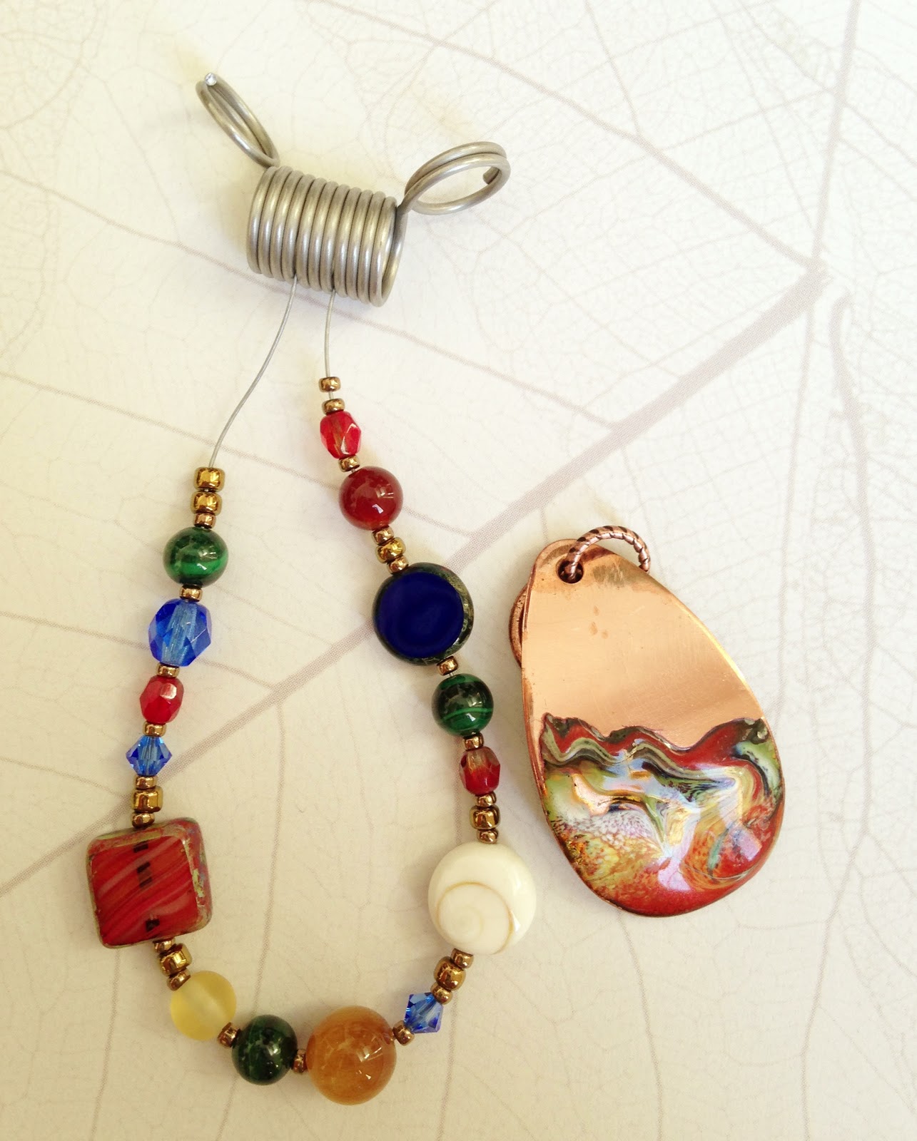
As you can see, the palette is filled with a whole rainbow of rich colors...so many options to choose from!  Since this is an art bead challenge, I started by digging out my boxes of focal beads and artisan clasps to see what I had that would fit the bill.  I found a lovely enameled copper pendant by Becka Beads out of Maple Lake, MN.  I had bought it (and a bunch of others) when she had a shop at the Minnesota Renaissance Festival.  The colors worked perfectly and I thought the swirls of color matched the feel of the painting as well.

I had my art bead...now to figure out where to go with the design.  The colors that jump out at me the most are the shades of green and the orangey reds.  I wanted to focus my colors there, but I didn't want to totally ignore all the other great colors in the painting.  Plus, I've really been wanting to get out of my monochromatic rut.  So, to that end, I pulled out a variety of blues, yellows, and even some cool off white shell beads with a swirl on them to add to the mix of possibilities I had already started.

Originally I thought I'd do something with copper wire links and chain...maybe add in some of the new copper plated bead caps I bought from Nunn Design.  As I sat there staring at my pile of beads, willing them to bring themselves into some order, I suddenly wondered if stringing beads might be the answer.  I grabbed a scrap of beading wire, dumped out some bronze colored seed beads to use as spacers, and started stringing my motley collection of bead shapes and colors.  Here is the result of this little experiment...


I showed my progress to Eric (who often acts as my color and design consultant) and we decided that we liked the idea, but needed to nix the bright blue Swarovski crystals and Czech glass in favor for more subtle blue beads.  The blue is very present in the painting, but not really so much in my pendant.  Back to the drawing board to grab some more beads to add to the mix and I had my design direction.

I wanted to do a front clasp since I had a great leafy branch toggle from Nunn Design that would add an organic touch to the necklace.  Usually when I string beads I tend toward a symmetrical pattern...or at least something a little more subtle in the mixture of colors, sizes, and textures.  I ended up using a variety of Czech glass beads, malachite, carnelian, lapis, shell, and a couple of varieties of jasper. 


This necklace is a bit out of my normal comfort zone, but I like the end result.  I think the variety of colors and shapes in the beads, along with the swirls in the shell bead and pendant, mimics the frenetic color energy in the inspiration painting.

Wednesday, February 20, 2013

Buzzin' Around

I'm sure that you can all imagine that I have been buzzin' around trying to get ready for the Artsy Market (and I have!), but that's not what this post is about, not really.

In one of my first orders of Vintaj supplies I picked up a pack of Queen Bee Connectors and some Busy Bee Charms.  I'm not sure why I bought them, just because I thought they were cute I guess, and they've been sitting in my stash for a while.  Now they languish no more!

Also in my stash was a ceramic bee pendant from Kylie Parry.  In the process of making a necklace with that piece (and getting a little "stuck" on that one) I ended up making this super cute set of Honey Bee Earrings.  I love the way these yellow beads that I picked up on a whim look a little like honey comb and a little bit like bee hives!


Next came the matching Honey Bee Necklace.  I added some fun new clear yellow teardrop shaped beads above the bee connectors so that I could do just one strand of chain around the back of the necklace.  In a pleasant surprise, these links look like pollen that these busy bees have collected!


After these two projects were done, I finally went back to the necklace that I had originally meant to make with renewed inspiration.  It's funny how "productive procrastination" often works out for me.  So here is my last bee piece...for now anyway!


Wednesday, February 13, 2013

February Art Bead Scene Challenge

If you are at all interested in art beads or jewelry making, there is a fabulous blog called Art Bead Scene (or ABS for short) that does a monthly challenge based on a piece of art.  The only real rule is that any creation you enter must include an art bead (i.e. a bead, charm, button or finding made by an independent artist).

I participated for the first time last month when I was inspired by an awesome painting of peacocks, but this is the first time for me to enter since I started my blog.  Part of the fun of these challenges is seeing what everyone else made in the blog tour that ABS hosts at the end each month.  I'm excited that I will get to take part in that part of the process this time!

Anyway, enough background.  Let's talk about this month's challenge and the inspiration behind it.

Heijinja, 1941

Tōshi Yoshida
Woodblock Print

I had originally sworn off participating in another design challenge until I get done with an upcoming craft market I'm participating in during the first weekend in March (more about that in a future post!).  But when I opened my package from Nancy Schindler of Round Rabbit the other day, I knew that I had to change my mind because her Petals Pendant in Antique Rose (on the right in the picture below) was perfect for this challenge.  The fact that it arrived the day after the artwork was announced made it feel like destiny.  The colors in shades of pink, burgundy, and grey in the focal were just right... I also thought the lines running behind the flowers were evocative of the architecture from the print.

So, having made my decision to participate, I set off to dig through my boxes and boxes of beads and pulled out a wide selection of possibilities.  I also found another Round Rabbit pendant that might become a second entry for this challenge if I get my act together!  From here I culled it down to my very favorites and then started playing around with different bead combinations.  The only thing I knew for sure was that I wanted to work in some of the freshwater pearls in light peacock to pull out the grey tones from the print and the pendant.


I picked out a gorgeous Green Girl Shibuichi Rose Blossom clasp that I've been hoarding for years because the flower reminded me of the cherry blossoms in the print.  Wanting to use other metal pieces that played up the unique color of the shibuichi (an alloy of copper and silver), I broke out my metallic Vintaj patina paints.  You can see the clasp below with natural brass on the left and painted pieces on the right.  In the end, I only ended up using one of the painted jump rings, partially because I liked the darker natural brass and partially because some of the other elements didn't work with my final design.  I'm sure I'll find a good home for the other painted pieces in other designs soon!


So, without further adieu, here is my finished design.  I stuck to the more muted side of the palette from the print focusing mostly on the pinks from the cherry blossoms and the grey from the rooftops and background.  There are hints of darker red in the pendant and some of the beads but nothing too terribly bright.  The luster in the clasp and the pearls add richness and depth to the design.


My friend Kathleen exclaimed, "But it's so muted for a Sarajo!"  She may be right that this color palette is outside my normal comfort zone, but I think the color choices speak to the quiet beauty of the scene in the artwork...at least that was my goal.


Adding a P.S. to this blog post....  I did actually manage to create as second piece in response to the artwork.  Here it is!