Sunday, February 28, 2016

Inspired by Reading: A Wrinkle in Time

The latest book selection for the Inspired by Reading Book Club was A Wrinkle in Time by Madeline L'Engle.  I've been eagerly awaiting this one since this book has a special place in my reading history.  I'm a little late getting my post up... more on why in a bit. 

Just two of the many covers that this book has had over the years.
Even though I do own a copy of the book in my personal collection, I waited to borrow one from the public library because I wasn't convinced that my "vintage" copy would withstand me reading it.  It's a copy from my childhood and is pretty yellow and brittle, but it does have the cover I grew up with... the one on the right in the picture above.  I was oddly put off by the cover of my borrowed library copy... it was the one on the left above and was created by famous husband and wife illustrator team Leo and Diane Dillon.  I really enjoy much of their work and they're even responsible for some of my all time favorite book covers (you can see an archive of their work HERE) but I just found this cover slightly off-putting for some reason.  I'm not sure that I would have picked the story up as a kid if that had been the cover on the copy I found.  Maybe I'm just reacting because it's not the version with which I'm familiar.  If you're interested to see the other cover versions, click HERE.  Did anyone else have a reaction to the cover art for this one?  or another favorite that you went back to revisit? 

Ok, pushing past the cover art and onto the book itself!  A Wrinkle in Time was first published in 1962 and has been continuously in print ever since.  If you know anything about the publishing world, you know that this is a pretty amazing feat!  Part of that longevity can be attributed to the fact that Wrinkle won the prestigious Newbery Medal... but it's bigger than that since plenty of award winners have gone out of print.  I was curious to re-read the story to see how I responded to it as an adult.

I first read this book when I was in elementary school and an older cousin let me borrow a copy.  I was instantly hooked and had to speed through and read the two sequels that existed at that time (A Wind in the Door and A Swiftly Tilting Planet).  Unfortunately, for me at least, you can't go home again.  My adult re-read of Wrinkle left me disappointed to say the least.  I feel really guilty about my reactions... it feels like a betrayal of my youth services librarian roots or something.

Part of it is that Wrinkle falls into the same trap as many stories that are written as contemporary fiction... what was totally normal life in 1962 feels quite dated in 2016.  Genre fiction (with the exception of maybe mystery) can often get around this pitfall since they are set in another time and place... well defined and different from our own.  But it was more than that, the dialog just didn't work for me.  Yes, the slang was beyond outdated, but the dialog was generally clunky in my opinion.  I really don't mean to trash a children's classic... it made me sad that I just couldn't get immersed in a story that had so captivated me once upon a time.  I hope I'm just a weirdo and others still can find a connection here... I just didn't.  (Eric tried to read it but had to put it down for similar reasons and because he wanted to hold onto as much of his original reading experience as possible.) 

Because of my lackluster response to the book, I had a really hard time coming up with any sort of jewelry design based on it.  I really pushed myself to make something... anything... just because I wanted to reflect on my reactions to the book.  Here is what I ended up with:       


I finally settled on doing something to play off of the idea of the "Dark Thing" around the dark planet of Camazotz (and many others) as well as travel through outer space.  I started with a pair of lampwork beads by Firelily Glass that have darker tones to them and what feels like a alien sort of pattern to them (at least in my mind!)  I mixed in some dark black and grey Czech glass, brass, crystal, and some moon and star beads in brass tones. 


Monday, February 22, 2016

The Honey Do List: February 2016

In case you haven't heard, my sweet husband has thrown down the beady gauntlet this year and is issuing me a monthly design challenge... The Honey Do List!  Each month may be something totally different... stay tuned to see what he dreams up for me this year!  For February he's given me a little dose of spring with a color palette taken from one of his photos.


Here's what Eric had to say about this month's challenge:

I've finally been going through some of last summer's photos, getting a welcome burst of color in these white-washed snowy months.  I discovered this shot of a flower (no idea what kind it is) and really liked the greens and earth tones in it.  I figured Sarajo would surely have something in this color palette in her giant dragon's hoard of beads! 

I knew exactly which bead I would use as soon as I opened the files that Eric sent me.  There was no question in my mind at all that it had to be a large green and orange flower pendant that I bought from Tracee Dock of The Classic Bead.  This was one of my early purchases from Tracee that I made when we met her on a trip to Kansas City.

Starting to pull things together!
I wanted the necklace as a whole to be as big and bold as Tracee's pendant so I went digging for some chunkier beads in shades of green and orange.  Here's what I came up with:


I started my design with the wire wrapped side.  For some reason, that big luster green English cut glass bead just wanted to be on it's own instead of strung with other beads.  I built it out from there adding in carnelian rounds and some bright tangerine Czech glass to bring out the bright center of the flower pendant.  The large carnelian faceted rondelles that I pulled had to be strung due to a small hole size, so I played around with different combinations and patterns until I found something that pleased me.  There's no doubt that the finished product is a serious statement piece! 

On a whim I shared the challenge in a couple of Facebook Groups for jewelry makers.  I was thrilled to discover that other folks were excited by the challenge and wanted to play along with me!  Stop by and see what everyone else was inspired to make for this month's Honey Do List challenge!

Alison Adorns
Gloria Allen   
Terry Jeanette Carter
Jenny Kyrlach   
Kathy Lindemer 
Laurel Ross
Jeanne Marie Steck
Sarajo Wentling - You are here

I don't know if people will always be interested in joining in the Honey Do List challenge, but next month's just might get creative juices going!  (Eric has given me a sneak peek at his March challenge.)  Check back here on March 1st to find out what he has in store for me and to see if you want to play along next time!


Friday, February 19, 2016

We're All Ears: February 2016

I'm intrigued by the inspiration that Erin Prais-Hintz chose for this month's We're All Ears challenge.  She picked a gilded copper alloy statue of a standing Buddha from the collection of the Metropolitan Museum of Art.  You can see more great pictures and read more about him over on the Earrings Everyday blog HERE.  It's hard to tell from this picture, but if you go to the link in the picture's caption you can play with a cool zoom feature and see the flowers on his palm.  Even though I know it's supposed to be a flame on top of Buddha's head, I think it has a flower-like quality too.

http://metmuseum.org/collection/the-collection-online/search/75414
NOTE: This artwork is to be used for educational purposes only.
Those of you who have been following my blog have probably noticed that I don't really design much with gold.  Antiqued brass, yes... gold, not so much.  I think you can see why I needed to push outside my metal comfort zone for this one!

I didn't have much in my stash that was speaking to me, but I did a quick search as I was finishing up my order over at Lima Beads and they had just the things I needed!  I snagged some teeny gold plated lotus blossom charms by Nunn Design as well as some lotus flower shaped decorative earwires (those are sterling, but I had to have them!).  Here's what I came up with:


My first pair is the most true to the inspiration since I worked in gold tones.  I paired the little lotus blossom charms with some bronzed amethyst crullers, gold plated beads, and some plated hematite rondelles (I used those little guys all the time... I wish I had bought more than one strand!).


The lotus shaped ear wires were far more dainty than I had anticipated when I ordered them, throwing me temporarily for a loop.  Even beads that I normally think are on the small side for earrings would seem way out of proportion to the delicate size of the ear wires!  Finally I found a few tiny faceted labradorite rondelles that were small and sparkly enough to work.  I honestly don't think I've ever made a pair of earrings this small before and they were a bear to photograph!  I really needed a macro lens this time.

Be sure to pop on over to the Earrings Everyday blog HERE to see what everyone else was inspired to make this month!

Monday, February 15, 2016

Variations on a Theme

I love the idea of having a basic design that you can make again and again.  I have several favorites in my repertoire like my dragonfly bracelets and several different earring designs.  I make them in different colors and with slightly different beads but they are essentially the same design... not the one of a kind creations that I love to make but still fun and with (I hope) my stamp on them.  Coming up with a new design and working out the kinks is what takes a lot of my jewelry making time so it's nice not always having to reinvent the wheel every time I sit down to make.

What I REALLY love is a design that is repeatable yet still results in one of a kind jewelry pieces.  One of those favorites is a bracelet design by Lorelei Eurto from a past issue of Bead Style magazine.  Just switch out the art beads and what you pair with them and you've got a completely different look!

Admittedly, bracelets are not usually my favorite thing to make (probably because I don't wear them often), but these bracelets are addictive!  I used this design for my Art Bead Scene entry this month (you can see that one HERE if you missed it) and I just started itching to make more.  Who am I to argue with my muse?  I hunkered down and got busy making more of these fun bracelets over the weekend!  I had bought a bunch of beads by Golem Design Studio just for this purpose a while back so a bracelet making binge was long overdue!

On Friday I whipped up one last item with Valentine's Day in mind.  I'm not really a pastel or pink girl, but I love how this one turned out.  The main focal is a chocolate clay lentil with white polka dots by Golem Design Studio that I got in a destash lot from Andrew Thornton (I used some of the vintage seed beads from the same lot too).  I paired it with a lampwork bead by BeadyGirl Beads and some large hole faceted rose quartz plus lots of yummy Czech glass and seed beads all on maroon Irish waxed linen.


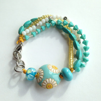
I went a lot brighter for this next bracelet featuring a Golem focal with a happy daisy design on turquoise blue.   I like the addition of the white glass, yellow seed beads, and pops of silver to keep it from being too monochromatic.  I'm thrilled that I finally found a good use for the bright yellow waxed linen that's been in my stash way too long! 


From there I went back to my color comfort zone with two additional bracelets using shades of aqua, teal, and turquoise paired with copper and bronze metallic accents.  I'm hard pressed to pick a favorite between these next two.

One features another gorgeous lentil bead by Golem Design Studio (I'm dying for the colors in this one!) paired with Greek copper and crusty lampwork beads.  I used several different colors and shapes of Czech glass along with some crystal to round things out.  I think the turquoise is just yummy with the copper and deep brown ceramic.   


Last, but certainly not least, I actually made one without a Golem bead!  I'll bet you were starting to think that wasn't possible.  This one felt like it designed itself... I love it when the beads just come together that way.  While digging for beads for a different bracelet, I found the cool teal and copper polymer clay bead in a destash goody bag (from Andrew again!) and thought the Greek copper would work well with it and some juicy lampwork.  There's a good mix of textures in the body of the bracelet with the shiny bronze, matte seed beads, recycled glass, and Picasso finish teardrops. 
          

I'm still playing with a few more projects that I hope to complete before moving onto the next thing on my to-do list.  I always forget what a mess I make when I'm into a big session like this... here's a peak at my work area.  I have to have ALL the beads and ALL the linen out to ensure I make the best match for each bracelet.  Ok, this is no where near all of my beads, but it's a good chunk of the smaller ones!  Plus, what you can't see is that there are boxes on the floor by my chair.   
 

What about you?  Do you have favorite designs that you like to revisit?  I'd love to hear about it! 


Monday, February 8, 2016

Art Bead Scene: February 2016

This inspiration for this month's Art Bead Scene challenge is a Vogue magazine cover from January 1925.  It features the Simultaneous Dress next to the Simultaneous Car by Sonia Delaunay as illustrated by George Lepape.  To read more about the Sonia Delaunay and her artwork, check out the ABS blog HERE.  


I have to admit that the color palette is a little too "America!" for my taste... It just feels like Fourth of July I guess.  On the other hand, I am intrigued by the chevron and triangle shapes in the dress and car.  Unfortunately, my bead stash doesn't really lend itself to sharp geometric patterns.  I'm more of a round girl I guess. 

I was thinking that this month might just be a simple pair of earrings with some lampwork beads but then I managed to find a carved ceramic lentil bead from Golem Design Studio that had some promise!  Even though it has a floral or leaf pattern, it'd got a geometric look to it that I think works.  As soon as I decided on the focal I knew I had to make a version of a bracelet that Lorelei Eurto shared in Bead Style magazine a while back.  (This is such a fun and versatile design and I've been itching to make some more of these guys!)


Lampwork beads from BeadyGirl Beads and Firelily Glass round out the art bead goodness in this bracelet.  Most of my smaller blue beads were a little too bright and red is the more dominate color in the inspiration piece, so there's a definite focus on the red in my bracelet.  I added in some plated steel seed beads and pewter rice shaped beads to pull in the chrome from the car.

I'm surprisingly pleased with how this piece came together... proof that it's good to get out of your comfort zone from time to time.  This baby is headed to Unearthed Arts later this week!