 |
"The White Rose and the Red Rose" 1902
by Margaret Macdonald
|
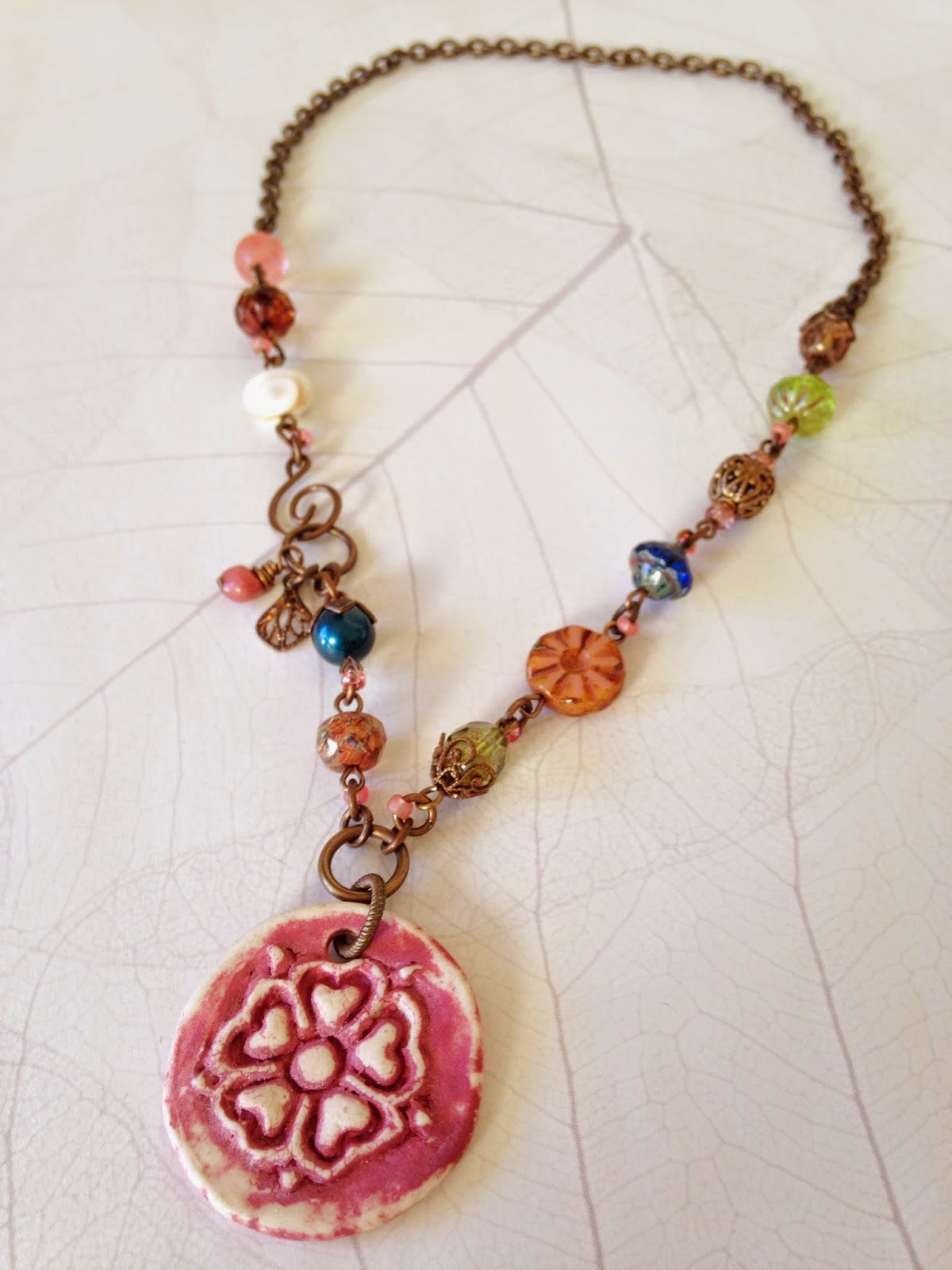
Other than the beige/tan background colors, the mauve stands out as the most dominant color. As I looked through my art bead drawers, my eyes settled on a (porcelain?) flower pendant made by Andrew Thornton. He had tucked it inside an order as a thank you and I'm thrilled to have found a great use for it! It's hard to tell in my pictures, but it has a nice shimmer to it that I love.
I chose mostly beads with pink or rosy tones to them and also pulled in additional tiny touches of pink by adding seed beads to the jump rings that connect my beaded links. I didn't want to go all monochromatic though so I also picked some Czech glass and a Swarovski crystal pearl in shades of blue and green. In honor of the shell used in the original (on the original?), I added one little shell bead in white and tan to the mix.
My blue and green may pop out a little too much... I can see how one might want to go with the more muted tones. That bright blue especially spoke to me and I had to include those pops.
I will have this piece for sale during the Art Wander later this month. Hopefully the right person comes along for this one!


This is a beautiful necklace. I don't think the blue and green pop too much at all. I was intrigued by the brighter blue in this piece and how it looked in Brandi's first palette. I love the seed beads on the jump rings - it's like all those beady dots on the swirl lines in the inspiration piece. And the shell!
ReplyDeleteThe piece you made is great! I love the clean lines and eclectic mix of Czech glass. The pendant is porcelain and is a stylized Tudor rose, which from the title of the painting might have similar inspiration origins.
ReplyDeleteWonderfully composed. I like your bead choices and that you went with the stronger colors. It just works!
ReplyDeleteVery pretty. I do like the bright colors.
ReplyDelete